手把手实现 Select 组件
2025年07月22日 Tags: Vue
在写个人博客这个网站的时候,手动实现了几个 UI 组件的封装,觉得 Select 组件还是有些点可以拿出来说一说的。
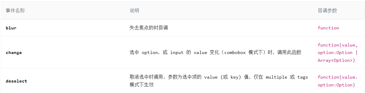
首先扒一下各大 UI 组件库的 Select 组件,这里拿 AntD 的 Select 组件作为参考,这里我们需要用到的属性和事件如下:
属性:


事件:


需求分析:
- 组件结构
(1)输入框(单选/多选是并不能真的输入,只是用于触发下拉框的展示)
(2)下拉列表(动画)
(3)多选/标签模式,对用户选中选项进行打勾,区分展示。
(4)标签模式,需要在输入框中 inline 展示标签列表。
- 功能需求
(1)支持单选/多选/标签三种模式。标签模式下,可以通过输入新增标签。
(2)标签模式下,新增的数据是临时性的,需要用户自行请求保存到数据库中。
(3)标签可以进行删除。取消选中或删除时都会抛出 deselect 事件。
(4)多选时,组件初始自动显示光标。
- 重点分析
(1)事件冒泡和捕获,例如点击事件和功能冲突时,需要通过 mouse 事件来解决
(2)标签模式下,用户输入内容需要对内容长度进行计算,动态修改 input 的宽度。这是因为 input 跟在 tags 列表之后。这里借一个单独的 span 元素进行内容长度计算。
组件模板
<template>
  <div
    class="select-container w-full"
    tabindex="-1"
    @blur.capture="handleBlur"
    ref="selectContainerRef"
  >
<-- 使用 tabindex 使元素可以聚焦 -->
    <div
      class="selector"
      :class="{ focus: focusRef }"
      @mousedown.prevent.self="toggleSelectList"
      @focus.capture="handleFocus"
    >
      <!-- 加 prevent 防止影响input聚焦效果。self 是只有点击元素自己才 toggle,比如点击内部tag时不toggle -->
      <div v-if="!mode" class="selected-item"></div>
      <div v-else class="inline-block">
        <Tag
          v-for="item in selected"
          :key="item.value"
          class="mr-1 bg-slate-100"
          size="small"
          type="info"
          closable
          @close="removeSelect(item.value)"
          ></Tag
        >
      </div>
      <input
        type="text"
        ref="inputRef"
        v-model="inputValRef"
        autocomplete="off"
        :style="{ opacity: mode ? 1 : 0, width: inputWidth }"
        @input="handleInput"
      />
      <-- 使用一个单独的 span 标签用于计算 input 的宽度 -->
      <span ref="calculateRef" class="invisible whitespace-pre absolute text-sm"></span>
    </div>
    <!-- 下拉列表选项 -->
    <Transition>
      <div class="toggle-wrapper bg-white dark:bg-[--dark-nav-bg-color] shadow-md" v-if="open" ref="toggleWrapperRef">
        <ul v-if="newOptions.length > 0" class="select-list">
          <li
            v-for="item in newOptions"
            :key="item.label"
            :class="[{ selected: mode ? value.includes(item.value) : value === item.value }, 'bg-white dark:bg-[--dark-line-color]']"
            @click="changeSelect(item.value)"
          >
            <span class="dark:text-black"></span>
            <svg
              v-if="mode && value.includes(item.value)"
              t="1697609187051"
              class="icon"
              viewBox="0 0 1024 1024"
              version="1.1"
              xmlns="http://www.w3.org/2000/svg"
              p-id="1343"
              id="mx_n_1697609187051"
              width="20"
              height="20"
            >
              <path
                d="M761.906212 445.517843c-8.29492-11.749602-24.579815-14.544251-36.360116-6.250354L416.577209 656.558373 304.674583 499.339656c-8.292873-11.779278-24.564465-14.573927-36.33044-6.28003-11.778254 8.324596-14.572904 24.580838-6.277984 36.361139L388.992967 707.942671c8.293897 11.778254 24.565489 14.57188 36.344766 6.28003l330.318124-232.343719C767.405459 473.584062 770.230808 457.298144 761.906212 445.517843z"
                fill="#6610f2"
                p-id="1344"
              ></path>
            </svg>
          </li>
        </ul>
        <Empty v-else class="empty" />
      </div>
    </Transition>
  </div>
</template>
组件外部传递的属性
const props = defineProps<{
  value: {
    // 选中项的值(v-model)
    type: string | Array,
    default: () => [],
    required: true,
  }
  options: {
    // 下拉列表选项数据
    type: Array<{value, label}>,
    default: () => [],
  }
  mode: {
    // 多选模式(multiple)或标签模式(tag),不传则为单选模式
    type: string | undefined
  },
}>();
组件抛出事件
const emit = defineEmits(["update:value", "change", "focus", "blur", "deselect", "select"]);

const emit = defineEmits<{
  (e: 'update:value', value: string | [string]): void
  (e: 'change', value: string, value: string | [string]): void
  (e: 'focus'): void
  (e: 'blur): void
  (e: 'deselect, value: string): void
  (e: 'select', value: string): void
}>()
组件内部变量
const inputRef = ref<HTMLInputElement | null>(null); // input元素的引用
const inputValRef = ref<string>(''); // input的值
const calculateRef = ref<string>(''); // 用于计算input宽度的隐藏元素
const selectContainerRef = ref<HTMLDivElement | null>(null);
const newWidth = ref<number>(0); // 用于计算input的宽度
const open = ref<boolean>(false); // 控制是否显示下拉选项列表
const focusRef = ref<boolean>(false); // 组件是否是聚焦状态
计算属性
// 当为多选时计算input内容变化时input的宽度
// input 初始宽度为 4px,用于进行聚焦。因为 input 宽度的原因以及实际显示的输入框是div,因此聚焦和失焦事件需要祖先元素进行捕获处理。
const inputWidth = computed(() => {
  return props.mode === "tag" ? `${newWidth.value}px` : "4px"; // 计算input的宽度,8px为每个字符的平均宽度
});

const newOptions = computed(() => {
  // 依赖的响应式数据:
  // 1. props.mode
  // 2.inputValRef
  // 3.props.options
  // 判断props.options中是否包含inputValRef.value的值,如果包含则不添加,否则添加
  if (props.mode === "tag" && inputValRef.value) {
    const hasInputValue = props.options.some((item) => item.value === inputValRef.value);
    if (!hasInputValue) {
      return [{ label: inputValRef.value, value: inputValRef.value }].concat(props.options);
    }
  }
  return props.options;
});

// 计算选中的标签数据
const selected = computed(() => {
  const selectedList = newOptions.value.filter((item) => props.value.includes(item.value));
  return props.mode ? selectedList : selectedList[0];
})
事件处理
// 处理用户输入
function handleInput(e) {
  open.value = true;
  // input输入为中文时计算input宽度(输入状态input框内暂时显示的是拼音,需要进行处理)
  calculateRef.value.textContent = inputValRef.value + e.data;
  newWidth.value = calculateRef.value.offsetWidth + 4;
  if (inputValRef.value === '') {
    newWidth.value = 0;
  }
}

// 添加选中标签
function changeSelect(value) {
  if (!props.mode) {
    open.value = false;
    emit("update:value", value);
    emit("change", value, value); // 参数1:选中或取消选中的值(id/value),参数2:选中选项(单选是一个值,mode时为选中值组成的数组)
  } else {
    let list;
    if (props.value.includes(value)) {
      // 删除选择
      list = props.value.filter((item) => item !== value);
      emit("deselect", value);
    } else {
      // 添加选择
      list = [...props.value, value];
      emit("select", value);
    }
    emit("update:value", list);
    emit("change", value, list);
    if (props.mode === "tag" && value === inputValRef.value) {
      // 如果是tag模式且选中的是输入的内容,则清空输入框
      inputValRef.value = "";
    }
  }
}

// (多选)移除选中标签
function removeSelect(value) {
  const list = props.value.filter((item) => item !== value);
  emit("update:value", list);
  emit("change", value, list);
  emit("deselect", value);
}

// 展示/隐藏标签列表
function toggleSelectList() {
  open.value = !open.value;
  if (open.value) {
    inputRef.value.focus();
  }
  focusRef.value = true;
}

// 处理聚焦
function handleFocus(e) {
  if (!e.relatedTarget) {
    emit("focus");
  }
}

// 处理失焦
function handleBlur(e) {
  if (e.relatedTarget !== inputRef.value && e.relatedTarget !== selectContainerRef.value) {
    open.value = false;
    focusRef.value = false;
    emit("blur");
  }
}
扩展
计算 input 宽度
使用一个单独的 span 标签计算 input 的宽度时,我们通过监听 input 事件,然后通过 event.data 获取到用户在输入态时的内容(尤其是用户通过拼音输入法开始输入汉字时,用户输入时并不会立即成为 input 的 value,此时输入的内容会处于下划虚线的状态)。
用于计算宽度的 span 元素需要进行隐藏:
visibility: hidden;
white-space: pre;
position: absolute;
同时,span 字体样式大小要和 input 保持一致。
这里扩展一个内容 —— 输入合成事件
compositionstart
input 开始新的输入合成时触发
compositionupdate
字符被输入到一段文字的时候(输入状态变化)触发
compositionend
文本段落的组成完成或取消时触发
示例
const inputElement = document.querySelector('input[type="text"]');

inputElement.addEventListener("compositionstart", (event) => {
  console.log(`generated characters were: ${event.data}`);
});
但这里我们依然要处理用户输入字符、英文时的 input 宽度(输入内容会直接成为 input 的 value),因此直接使用 input 事件进行计算即可。
事件阶段
捕获阶段 ---- 目标阶段 ---- 冒泡阶段
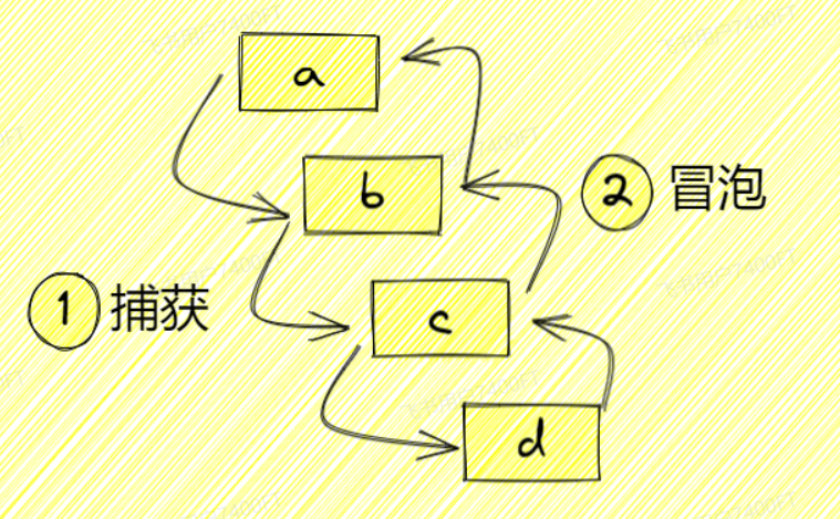
事件委托(捕获):触发事件时,事件从祖先元素逐级向下传递到 event.target。
事件冒泡:触发事件时,事件从 event.target 逐级向上向祖先元素进行传递。
默认情况下,事件执行顺序是从目标阶段到冒泡阶段。addEventListener 的第三个参数 useCapture(布尔值,默认 false)可以用来规定事件是按冒泡还是捕获来执行。
// 事件绑定为冒泡阶段
ele.addEventListener("click", (event) => {
  //...
}, false);

// 事件绑定为捕获阶段
ele.addEventListener("click", (event) => {
  // ...
}, true);
Select 组件中为什么使用的都是事件捕获?
🤔 首先 event.target 是 input 元素,但是 input 的元素宽度不定(最小为 4px),很难通过直接点击 input 元素来触发 foucs 和 blur;而且实际显示的输入框是外层的 div 元素,因此我们需要的事件传递顺序是由外至内的,也就是捕获阶段。而不是直接去点击 input 元素让事件冒泡至外层的 div 。
点击时为什么使用
mousedown而不是click事件?
这里我们先上一个示例。假设页面现在有一个 input 元素,我们为该元素注册以下事件:
const oInput = document.querySelector('input');
oInput.addEventListener("click", () => {
  console.log("click 事件")
})
oInput.addEventListener("mousedown", () => {
  console.log("mousedown 事件")
})
oInput.addEventListener("focus", () => {
  console.log("focus 事件")
})
鼠标点击一下 input 元素,可以看到控制台打印的事件执行顺序为:
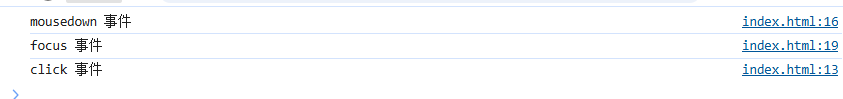
🤔 可以看出 mousedown 事件在 focus 事件之前触发,而 click 事件在 focus 事件之后触发。因此,这主要和事件执行的顺序有关,我们想要通过点击去让 input 进行聚焦,需要在 focus 事件之前进行处理。
为什么给
mousedown事件添加prevent(event.preventDefault()),mousedown事件有哪些默认行为?
因为 mousedown 事件存在默认行为:会让元素进行聚焦(元素本身可聚焦或设置了 tabindex 属性)。但我们要自行控制 input 元素的聚焦行为,因此需要阻止 mousedown 事件的默认行为。